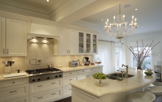
6 Tips to Save Money on Remodeling Your Kitchen

Remodeling your kitchen can be a large and expensive task. Saving money is always a good idea so here are a few tips to keep in mind that cut costs without sacrificing quality. We can help you have a functional and beautiful gathering space for family and friends. Are you planning a kitchen remodel on a budget? See how RedRock Finishes kitchen remodeling services can help you get the kitchen of your dreams!
1. Start brainstorming and getting ideas.
Get online and start looking at what others are doing on Houzz! You can put together a list and save all you favorite ideas in one place. Tried and true magazines are a good idea as well as Instagram and Pinterest too. Do a Google search for popular kitchen designs, you might be surprised what you’ll find. Visit a local tile shop or kitchen and bath store and see what they have, maybe you will find a great deal.
2. Maintain the same layout.
Moving plumbing and electrical systems is expensive and will put a dent in your budget quickly. Keeping the sink, refrigerator, range, shower valves, in the same location and remodeling around them is a huge savings! Try optimizing your storage space too! It is often cheaper than knocking out walls to gain additional storage, and it’s a great way to create more room in your kitchen. This can be done by adding wall-mounted shelving. Clean out and get rid of old, unused items and make easy access for the things you use often.
3. Keep existing cabinets if possible.
If your cabinets are in good quality and you like them, resurfacing is a great option! It’s amazing how color can transform a kitchen and a few coats of paint can give life to a dark, outdated space. Resurfacing and painting make for the most cost-effective option, but ensure that you take the steps needed to get a beautiful finish and consider hiring a professional, like us! The biggest cost in a kitchen remodel is new cabinets. The most expensive option is going custom, for which the cabinetry is designed, built and installed to specifically fit your space.
4. Consider alternative countertop materials.
There is a wide range of countertops to choose from — solid surfaces, recyclable products, concrete, tile, stone and more. Granite is still a popular choice for countertops, but at $50 to $100 or more per square foot, it can push any budget over the top. Consider using two different surfaces instead, like a butcher block island. This can cut the cost in half.
If granite is not in the budget but you like the look of stone, consider laminate, an inexpensive alternative. Laminate has come a long way with its high-definition selections and new cut-edge profiles. The new laminates look so much like stone, you could be easily fooled.
5. Don’t get carried away with a fancy pro-style range.
“While pro-style ranges look like they belong in a Food Network kitchen, they’re more likely to benefit a celebrity chef than you.” You’ll do just fine with a less fancy range. Save thousands of dollars with standard appliances. More than likely these expensive ranges will need more service and maintenance and nobody has time for that.
6. Be flexible with flooring.
Explore less expensive flooring options. If you already have solid hardwood flooring, just sand and refinish them, rather than replace them. Doing so will probably save you around 70% on the flooring portion of the budget. The two most popular and upscale types of flooring for kitchens are hardwood and tile. If you want to find a more practical and great value product, check out the engineered luxury vinyl planks. These products are relatively new and have rapidly grown in popularity. They look like wood, but they are waterproof.