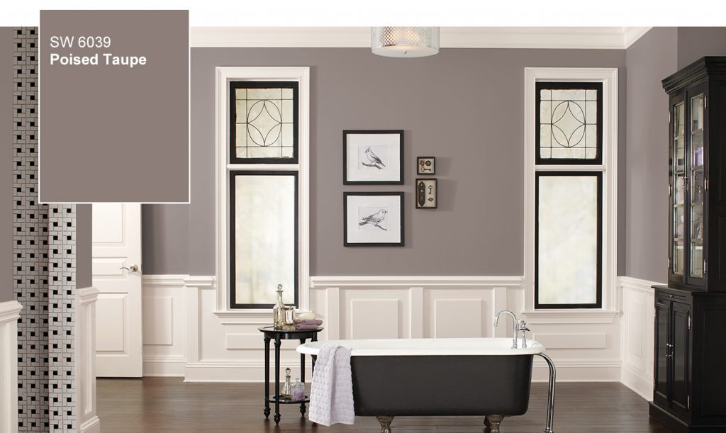
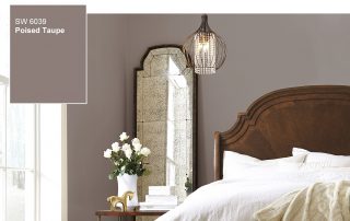
The “new” neutral, Poised Taupe is classic yet modern and the perfect balance of warm and cool
In a press release Sherwin-Williams announces Poised Taupe (SW 6039), as the 2017 Color of the Year. A modern take on a timeless classic, Poised Taupe signals a new direction in society’s ever-growing thirst for beautiful neutrals that bring warm and cool tones together to create one irresistibly versatile color.
“Poised Taupe celebrates everything people love about cool gray as a neutral, and also brings in the warmth of brown, taking a color to an entirely new level. Not cool or warm, nor gray or brown, Poised Taupe is a weathered, woodsy neutral bringing a sense of coziness and harmony that people are seeking,” says Sue Wadden, director of color marketing for Sherwin-Williams.
As the Sherwin-Williams team traveled the world to identify the latest trends and make this year’s selection, it became clear that neutrals are beginning a transition from the monochrome gray of the past five years to a more complex taupe and brown. In a recent homeowner survey conducted by Sherwin-Williams, nearly 40 percent of the respondents agree that they would like to incorporate warmer neutrals, such as warm grays, taupes or beiges, into their home décor. Additionally, more than two in five people identified taupe as a timeless neutral they would choose.1 Move over cool toned colors. A new trend is here.
The well-lived life in the home
Drawn from the Noir palette, one of four palettes in colormix™ 2017: The Sherwin-Williams Color Forecast, Poised Taupe addresses the search for authentic spaces that recharge the spirit in uncertain times and where perfection can seem like the ideal.
“Consumers yearn for spaces that feel welcoming and hug them as they enter. Earthen brown combined with conservative gray, creating Poised Taupe, embodies all of these emotions,” says Wadden.
With its cool-yet-warm vibe, Poised Taupe is an ideal backdrop for a wide range of color combinations, from pastels to brights to jewels. For example, when paired with the faded indigo of Stardew (SW 9138), it creates a charming palette reminiscent of a French countryside. Used in tandem with vibrant Rave Red (SW 6608), it evokes the natural feel of red-stained bedrock. And with the deep teal of Marea Baja (SW 9185) and sunny hued Bee (SW 6683), it transforms into a super-graphic look.